Reporting Dashboards for Supervisors and Managers
Complete guide to understanding analytics, generating reports, and using data for decision-making.
Understanding the Dashboard
Accessing the Main Dashboard
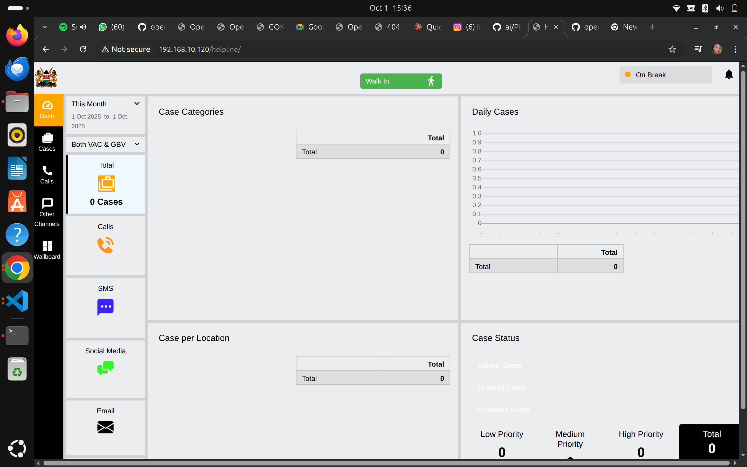
Navigation: Click "Dash" in the left sidebar
What You See: Comprehensive overview of helpline operations including case statistics, call volumes, geographic distribution, and status tracking.
Dashboard Components
The dashboard has four main sections:
- Case Categories (top left)
- Daily Cases (top right)
- Case per Location (bottom left)
- Case Status (bottom right)
Plus sidebar filters and channel breakdowns.
Sidebar Controls
Date Range Selector
"This Month" Dropdown:
- Current month (default)
- Last month
- This quarter
- Last quarter
- This year
- Custom date range
Purpose: Filter all dashboard data by time period
Use Cases:
- Monthly performance reviews
- Quarterly reports
- Year-over-year comparisons
- Campaign period analysis
View Type Selector
"Both VAC & GBV" Dropdown:
- Both VAC & GBV (show all cases)
- VAC only (Violence Against Children)
- GBV only (Gender-Based Violence)
- Non-VAC/GBV only
Purpose: Focus on specific case types based on your reporting needs
Channel Breakdown
Left Sidebar Shows:
Total Cases: 351
- Overall case count for selected period
Calls: 350 Cases
- Cases originating from phone calls
- Largest volume channel
SMS: (if active)
- Cases from text messages
Social Media: (if active)
- Cases from Facebook, WhatsApp, etc.
Email: (if active)
- Cases from email inquiries
Walk-in: 1 Case
- In-person visits
Case Categories Section
Visual Display
Pie Chart shows distribution of case types:
- Green: Non-Interventions (313 cases - 89%)
- Light Green: Information Inquiry (34 cases - 10%)
- Blue: Abuse & Violence (2 cases)
- Purple: Counselling (2 cases)
Data Table
| Category | Count | Percentage |
|---|---|---|
| Non-Interventions | 313 | ~89% |
| Information Inquiry | 34 | ~10% |
| Abuse & Violence | 2 | <1% |
| Counselling | 2 | <1% |
| Total | 351 | 100% |
Understanding the Categories
Non-Interventions (Highest Volume):
- General information requests
- Directory assistance
- Brief consultations
- Does not require case creation typically
- High volume is normal
Information Inquiry:
- Specific questions about services
- Eligibility inquiries
- Referral requests
- Educational questions
Abuse & Violence (Critical Priority):
- Physical abuse
- Sexual abuse
- Emotional abuse
- Domestic violence
- Always high priority regardless of count
Counselling:
- Mental health support
- Crisis counseling
- Emotional support
- Therapeutic intervention
Using This Data
For Staffing:
- High non-intervention volumes suggest need for FAQ resources
- Can some be handled by chatbot or automated systems?
- Allows counsellors to focus on serious cases
For Training:
- Are serious cases (abuse, violence) being properly categorized?
- Do staff need more training on identification?
- Review sample cases from each category
For Reporting:
- Track month-over-month category trends
- Identify emerging patterns
- Report VAC/GBV rates to stakeholders
Daily Cases Section
Time Series Chart
Displays: Number of cases handled each day over the selected period
Y-Axis: Case count (0 to max, e.g., 350) X-Axis: Dates (1 Oct 2025 to 1 Oct 2025 in example)
Data Table
Shows daily breakdown by channel:
| Date | Call | Walk-in | Total |
|---|---|---|---|
| 1 Oct 2025 | 350 | 1 | 351 |
What to Look For
Patterns:
- Which days have highest volume?
- Are weekends different from weekdays?
- Are there seasonal patterns?
- Do campaigns drive spikes?
Trends:
- Increasing or decreasing over time?
- Consistent volume or erratic?
- Impact of staffing changes?
Anomalies:
- Sudden spikes (investigate cause)
- Unexpected drops (system issues? Staffing?)
- Zero-case days (holiday? Outage?)
Using This Data
For Capacity Planning:
- Schedule more staff on high-volume days
- Plan training on low-volume days
- Anticipate seasonal fluctuations
For Goal Setting:
- Target number of cases to handle
- Growth projections
- Service expansion planning
Case per Location Section
Geographic Distribution
Pie Chart shows where cases originate:
- Blue (largest): (blank) - 308 cases
- Various colors: Named locations
- Nairobi: 4 cases
- Nakuru: 4 cases
- Kakamega: 3 cases
- Kiambu: 3 cases
- Makueni: 3 cases
- Tharaka-Nithi: 3 cases
- (and more)
Data Table
| Location | Count | Percentage |
|---|---|---|
| (blank) | 308 | ~88% |
| Nairobi | 4 | ~1% |
| Nakuru | 4 | ~1% |
| Other locations | 3 each | <1% each |
| Total | 351 | 100% |
Understanding "Blank" Locations
Why So Many Blanks?:
- Location not captured during call
- Caller refused to provide
- Quick information calls (didn't ask)
- System field left empty
Action Items:
- Train staff to always ask for location
- Make location field required
- Add "Refused" option vs leaving blank
- Improve data collection protocols
Using Location Data
For Service Planning:
- Identify underserved areas
- Plan outreach in high-need regions
- Partner with local organizations in hotspots
For Resource Allocation:
- Referral networks by location
- Translation needs by region
- Cultural competency training
For Stakeholder Reporting:
- Show geographic reach
- Demonstrate community impact
- Support funding requests for specific regions
Case Status Section
Status Indicators
Closed Cases (Green Bar): 250
- Cases successfully resolved
- Highest volume (good sign!)
Pending Cases (Orange Bar): 5
- Cases in progress
- Awaiting information or follow-up
Escalated Cases (Gray Bar): 0
- Cases requiring specialized intervention
- Transferred to higher-level support
Priority Distribution
Shows case urgency levels:
Low Priority: 340
- Non-urgent matters
- Standard follow-up schedule
- Most cases fall here (expected)
Medium Priority: 6
- Requires attention within 48-72 hours
- Moderate concern
- Monitor closely
High Priority: 3
- Immediate intervention needed
- Emergency situations
- Requires supervisor oversight
Total: 351
Health Indicators
Healthy Status Distribution:
- High % closed (250/351 = 71%)
- Low pending count (5)
- Zero escalations
- Few high-priority (3)
Concerning Patterns:
- Growing pending backlog
- Many escalations (capacity issue?)
- Too many high-priority (identification problem?)
- Low closure rate
Using Status Data
Daily Monitoring:
- Check pending cases every morning
- Follow up on high-priority immediately
- Ensure escalated cases being handled
Performance Tracking:
- Closure rate (target: >70%)
- Average time to close
- Escalation rate (target: <5%)
- Priority accuracy
Resource Allocation:
- Assign experienced staff to high-priority
- Balance caseload across team
- Identify need for additional resources
Generating Reports
Available Report Types
From Dashboard:
- Click "Reports" button (various locations)
- Select report type
- Choose parameters
- Generate
Report Options:
- Summary reports (overview)
- Detailed case lists
- Category breakdowns
- Performance metrics
- Custom reports
Report Filters
Common Filters:
- Date range
- Case category
- Priority level
- Status (open/closed)
- Location
- Channel source
- Counsellor/team
Tips:
- Start broad, then narrow
- Save frequently-used filter combinations
- Export raw data for custom analysis
Exporting Data
Click "Download" Button:
- CSV format (for Excel)
- PDF format (for printing/sharing)
- JSON format (for technical analysis)
Best Practices:
- Regular backups (monthly minimum)
- Secure storage of exported data
- Follow data protection policies
- Anonymize before sharing externally
Key Performance Metrics
Volume Metrics
Total Cases: 351 (this month)
- Trend: Up/down from last month?
- Target: Meeting organizational goals?
Cases by Channel:
- Calls: 350 (99.7%)
- Walk-ins: 1 (0.3%)
- Other channels: Monitor adoption
Daily Average: 351 cases ÷ 30 days = ~12 per day
- Helps with staffing calculations
- Compare to capacity
Quality Metrics
Case Closure Rate: 250/351 = 71%
- Industry benchmark: >70%
- Higher is better (but not rushed)
Pending Backlog: 5 cases
- Should be <5% of total
- Monitor age of pending cases
High-Priority Response Time:
- Track time from case creation to first action
- Target: Same day for high-priority
Efficiency Metrics
Average Case Duration:
- From creation to closure
- By category (abuse cases take longer)
- Identify bottlenecks
Counsellor Caseload:
- Cases per counsellor
- Balance across team
- Prevent overload or underutilization
Impact Metrics
VAC/GBV Cases: 2-4 cases this month
- Core mission metric
- Track interventions made
- Measure outcomes
Referrals Made:
- Number of successful referrals
- Partner organizations used
- Follow-up completion rate
Analysis and Insights
Trend Analysis
Month-over-Month:
September: 320 cases
October: 351 cases
Change: +31 cases (+9.7%)
Questions to Ask:
- Why the increase?
- Is it sustainable?
- Do we need more staff?
- Is quality being maintained?
Identifying Patterns
Time Patterns:
- Busiest days of week
- Peak hours
- Seasonal variations
- Holiday impacts
Category Patterns:
- Are certain types increasing?
- New emerging issues?
- Training gaps revealed?
Geographic Patterns:
- New areas reaching out?
- Declining regions (why)?
- Urban vs rural differences?
Data-Driven Decisions
Examples:
Finding: 90% of cases are information inquiries
Action: Develop FAQ page, chatbot for common questions
Result: Frees counsellors for serious cases
Finding: Nairobi has 4x more cases than other regions
Action: Open satellite office, hire Nairobi-based staff
Result: Better local service, reduced response times
Finding: High-priority cases often miscategorized initially
Action: Improve training on risk assessment
Result: Better triage, faster interventions
Reporting to Stakeholders
Monthly Report Template
Executive Summary:
- Total cases handled
- Key achievements
- Challenges faced
- Next month plans
Detailed Metrics:
- Volume by category
- Geographic reach
- Priority distribution
- Case outcomes
Highlights:
- Success stories (anonymized)
- Impact metrics
- Team performance
Needs and Requests:
- Resource requirements
- Training needs
- System improvements
Quarterly Report
Includes:
- 3-month trend analysis
- Goal achievement review
- Financial summary (if applicable)
- Strategic recommendations
- Case studies
- Team development updates
Annual Report
Comprehensive Review:
- Year-over-year comparison
- Total impact (lives touched)
- Major milestones
- Challenges overcome
- Future strategy
- Sustainability plan
Visualizing Data
For Presentations:
- Use dashboard screenshots
- Create simple charts
- Highlight key numbers
- Tell stories with data
- Show trends visually
Tools:
- Export data to Excel for custom charts
- Use PowerPoint/Google Slides for presentations
- Consider infographics for external sharing
Best Practices
Regular Review Schedule
Daily (5 minutes):
- Quick dashboard check
- High-priority cases
- Queue status
Weekly (30 minutes):
- Detailed metrics review
- Team performance
- Trend identification
Monthly (2 hours):
- Comprehensive analysis
- Report generation
- Strategic planning
Quarterly (Half day):
- Deep dive analysis
- Goal assessment
- Planning for next quarter
Data Quality
Ensure Accuracy:
- Regular data audits
- Spot-check cases
- Verify calculations
- Investigate anomalies
Maintain Consistency:
- Standard categorization
- Uniform data entry
- Clear definitions
- Training on standards
Privacy and Security:
- Anonymize sensitive data
- Secure storage
- Access controls
- Compliance with regulations
Troubleshooting
Dashboard Not Loading
Solutions:
- Refresh browser (F5)
- Clear cache and cookies
- Try different browser
- Contact IT support
Numbers Don't Match
Check:
- Date range selected
- Filters applied
- View type (VAC/GBV toggle)
- Data refresh timing
Missing Data
Possible Causes:
- Cases not finalized
- Filters excluding data
- Time zone differences
- System sync delays
Quick Reference
Key Metrics Summary
| Metric | Current | Target | Status |
|---|---|---|---|
| Total Cases | 351 | 300+ | ✅ Met |
| Closure Rate | 71% | >70% | ✅ Met |
| High Priority | 3 | <5% | ✅ Met |
| Pending | 5 | <5% | ✅ Met |
Dashboard Navigation
| Need | Click | Find |
|---|---|---|
| Overview | Dash | All metrics |
| Call Volume | Calls | Channel breakdown |
| Quality | QA | Performance scores |
| Staff Status | Wallboard | Real-time activity |
| All Cases | Cases | Case list |
Getting Help
Data Questions:
- Review this guide
- Ask senior supervisor
- Contact IT for technical issues
Training:
- Request dashboard training session
- Review video tutorials (if available)
- Practice with historical data
Next Steps
- Quality Assurance Monitoring - Evaluate service quality
- Team Workflow Management - Manage daily operations
Remember: Data tells stories. Your job is to listen to what the numbers are saying, identify patterns, and take action to improve service. Good data leads to good decisions, and good decisions save lives.